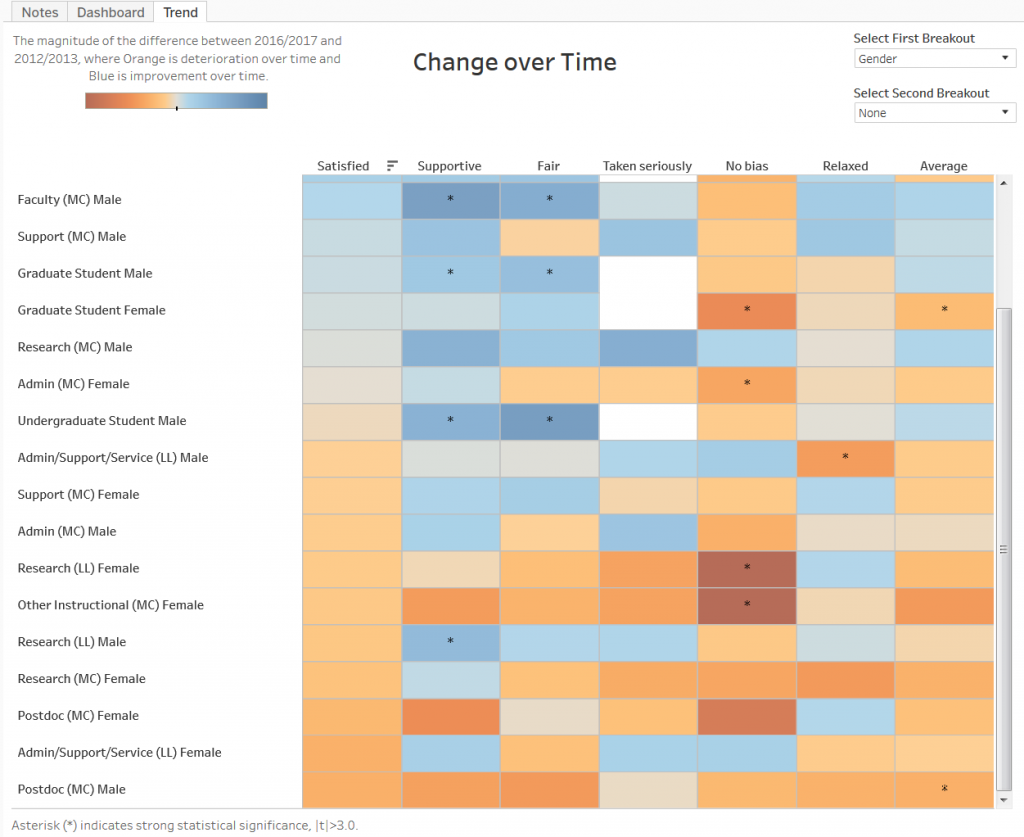
The climate for inclusion at MIT is changing. It is improving for some groups and becoming worse for others. For the first time, we can quantify this using the new MIT Climate Dashboard.
A few weeks ago I presented the first version of this dashboard, which included an assessment of the experience of many different groups of students and employees based on campus-wide climate surveys administered in 2016 and 2017. Since then, the MIT Office of Institutional Research has added survey data obtained four years earlier, allowing us to see the change with time. The dashboard allows one to view results from the 2012-2013 and 2016-2017 surveys (click on the “Dashboard” tab and use the radio button to select the year) and to look at the change with time (click on the “Trend” tab). The default view shows mean results for each of 6, 7, or 8 survey items for 11 groups of students and employees (called “role” below). Two dropdown menus “Select First/Second Breakout” allow one to subdivide these groups based on demographic information. Hovering the mouse over a cell shows statistical information for the responses of a given subgroup and survey item. Information about the surveys, the survey items used, and the demographic groups is given in the “Notes” tab.
 A special feature of this dashboard is the ability to sort groups based on mean responses to a given survey item. For example, in the 2016-2017 Dashboard view shown here I’ve used Gender and Race/ethnicity as breakouts and have hovered the mouse over the “Taken seriously” area at the top of the fourth column. A little symbol with three stacked bars and a down-arrow appears. Clicking on that symbol sorts the groups according to the extent to which the groups feel they have to work harder than others to be taken seriously. If they do, the cell is orange; if not, it is blue. The results show that men generally disagree that they have to work harder to be taken seriously:

Clicking the three-bar symbol a second time reverses the order of sorting, so that those groups who most agree they have to work harder to be taken seriously appear at the top. They are predominantly women:
Clicking a third time orders the rows alphabetically by group name (left column) as in the original ordering.
The dashboard uses mean values obtained from the distribution of responses for a given survey item. Most of the survey items have a five-point Likert scale for which the numerical values are chosen to range from -2 to +2 in steps of 1 and a color scale is used to display the means (one can also get the numerical values by hovering the mouse over a cell). Statistical tests, for example the ability to distinguish two samples, show that most of the statistical power is contained in the mean values. The sample sizes are large enough (minimum 15 responses per cell) so that the standard errors are generally smaller than 0.2. While results with especially high statistical significance (p<0.001) are denoted with an asterisk, color differences larger than about 0.15 (1/10 of the full range of the orange-blue color scale) are generally statistically significant. Note that statistical significance does not exclude the possibility of response bias; it may be that non-respondents to the survey would have different views than respondents do of the climate for inclusion. However, for most groups, the response rates exceed 40% (and exceed 60% for main campus administrative support staff and faculty), so these results reflect the views of a substantial fraction of the MIT community. About 13,000 people responded to the 2012-2013 surveys and 11,500 to the 2016-2017 surveys.
The data presented here may be unique for a university or other medium-size organization. Nowhere else have I seen information publicly presented about the climate for inclusion of an organization showing demographic breakdowns (including the ability to select multiple social identities, showing effects of intersectionality) and change with time. I hope that readers will point to other examples, or that they will encourage their own organizations to follow MIT’s example.
Why? Because without data, we are blind to the inequities present in our schools and workplaces. We have no idea whether our community members’ experience aligns with our organizational values. If we want to improve our workplace culture, we have to measure it, find what is wrong, apply interventions, and measure again to see their effect.
What do the climate surveys say about MIT? What is going well, what needs improvement, and what effect have interventions had?
There is a lot of information present in the dashboard. Surveys do not provide a controlled experiment nor are they sufficiently precise to answer every question. With these caveats, here are some findings from the surveys:
- Of all the group characteristics (role, gender, race/ethnicity, sexual orientation, major status, tenure status), gender has the most discriminating power, followed by role, sexual orientation, and race/ethnicity. Major status (undergraduates only, this distinguishes predominantly first-year students who have not declared a major from upperclass students who have) has an effect as does tenure (for faculty only), but gender and role have the most predictive power in how one experiences MIT. Excluding students, almost all of the variance in responses to the “Taken seriously” item arise from social identity (gender, sexual orientation, race/ethnicity); social identity also accounts for most of the variance in the “No bias” item. For the other items role has the largest effect.
- Students respond much more negatively than other groups to “Taken seriously” (i.e., they are much likely to agree that “I have to work harder than some of my peers to be taken seriously” than employees are). (Students were asked this question only in 2017.) This might be ascribed to impostorism, i.e. the fear of being revealed to be incompetent despite high ability and achievement. However, the large gender differences in this item suggest that not being taken seriously may be due more to the environment than to the individual. As a female graduate student asked me, “Why do you call it impostorism when we are treated as though we really don’t belong?” A similar point was made in an article last month in the New York Times.
- Between 2012-2013 and 2016-2017, the range of mean responses grew for each category of social identity. In other words, mean differences grew when comparing men and women, whites and underrepresented minorities, heterosexual and Lesbian/Gay/Bisexual or Unsure/Other (this selection is mainly a proxy for queer, transgender, and other non-binary identities). In particular, the experience of women became worse (based on the average of all survey items) for all groups expect faculty while the experience of men improved in almost every group (with exceptions for administrative staff, postdocs, and research staff at Lincoln Lab).
- The largest gender differences occur for Other Instructional staff (mostly lecturers and instructors), faculty, and research staff at Lincoln Lab. This result affirms reports I have heard from women in these roles.
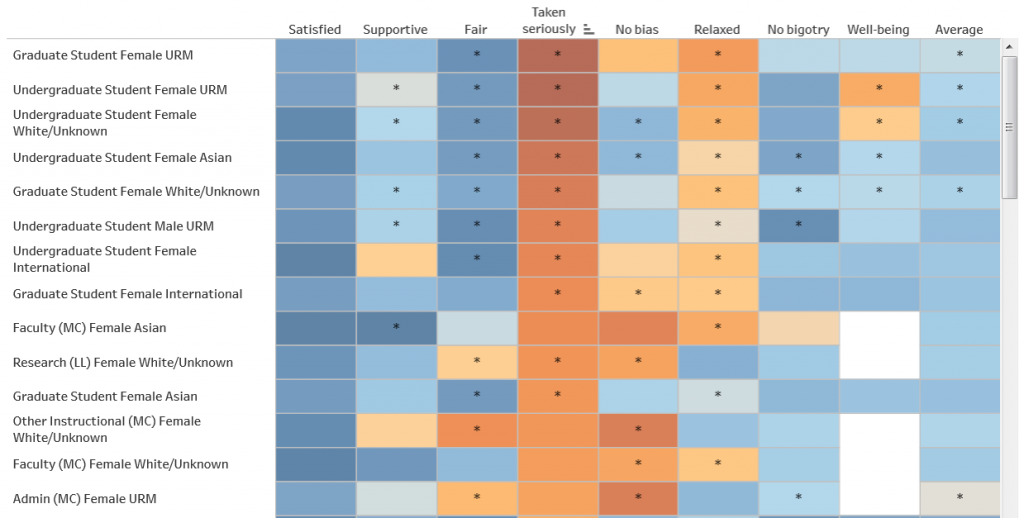
- Similarly, the experience for LGBTQ students and employees became worse between 2012-2013 and 2016-2017. Combining gender and sexual orientation leads to the largest spread of experience. The groups with the most negative experiences are female LGBTQ graduate students, support staff, and undergraduates (as well as all female Other Instructional staff), and their experience generally worsened from 2012-2013 to 2016-2017. Conversely, the groups with the best overall experience are male, and their experience generally improved. The growing disparity of experience should be concerning to institutional leaders.
- The “Fair” column provides a good proxy for social status. Based on their sense of fairness, the most privileged groups are undergraduates, graduate students, and faculty, while the least privileged are service staff, administrative staff, and support staff. Although some people may be surprised to find students feeling treated most fairly, others will recognize that even at a technical institute, administration and faculty are most solicitous of students (especially undergraduates).
- In 2012-2013 service staff had the worst average climate rating of any group at MIT; in 2016-2017 they had the best, and were the most satisfied group. Why? I believe much of the reason is the SEIU contract negotiated in 2016, which resulted in a substantial pay raise for janitors.
- Postdocs declined from the 4th to 9th place (of 11 groups) in the climate rankings over the four years between surveys. They experienced the most negative change. I don’t know exactly why this happened but it may be related to low salaries for many life sciences postdocs combined with other challenges identified in the National Postdoc Survey.
- Overall, effects of race/ethnicity are smaller than those of gender and sexual orientation during this time period at MIT. The climate for racial minorities improved with time for faculty and non-research staff at Lincoln Lab while declining slightly for other groups. I believe the improvements are due in part to efforts to improve the racial climate on both the main campus and Lincoln Lab such as the establishment of Employee Resource Groups and substantial anti-racist programming by the Institute Community and Equity Officer and other groups.
- The “[Not answered]” group (i.e., people who did not answer the sexual orientation demographic question) consists mostly of people who did not complete the survey after starting with the first question (“Satisfaction”). Because the number of responses to the later survey items is small, this group is subject to unknown response bias. It was included for completeness, but any results from this group should be used with caution.
- Compounding effects of social identity (i.e., intersectionality) are apparent when one chooses two breakouts. Combining gender and sexual orientation produces the most positive (for heterosexual men) and negative (for LGBTQ women) climates. (Gay men who are faculty or research staff at Lincoln Lab are also among the top-ranked groups for a positive climate, revealing the complications of intersectionality.)
What next? The reader may ask why we don’t extend the analysis prior to 2012-2013, why we don’t include certain groups like people with disabilities, or how their own department ranks. For the first two, we lack good survey data; MIT has been changing its survey questions over time, and the only longterm baseline we have is overall satisfaction. By this measure, there has been substantial overall improvement during the last 20 years, but the analysis by demographic groups is available only in recent surveys. We haven’t asked about disabilities. We do have information on respondents’ work units (academic department or otherwise), but in most cases the number of respondents is small and does not allow for dividing by demographic group (given our requirement of 15 or more responses). The ICEO Report showed that department or work unit is, like role and social identity, a source of considerable variation in the climate for inclusion. This information is available to the administration and is being used to help improve department climates. I hope that, going forward, MIT will continue to ask the subset of questions used in this dashboard, and will seek additional demographic information about respondents. In particular, respondents should be given the ability to specify (optionally) both sexual orientation and gender identity.
To discern the experience of groups not separated out in the survey, or for groups with small numbers of responses, interviews and focus groups are necessary. As described in my first entry about the climate dashboard, during the 2018-19 academic year we will be conducting a qualitative project to obtain such information. In addition to highlighting the experience of groups not represented in the surveys, we will also obtain information to help explain the patterns identified above. This will help guide future interventions to improve the experience of everyone in the organization.