Assessment is a crucial step for any change effort. The 2015 ICEO Report devotes a chapter to this topic, where it presents a preliminary analysis of the climate for inclusion at MIT using both quantitative (survey) data and qualitative (individual interviews) data. After several more years of work to refine the quantitative measures and their presentation, the ICEO and Office of Institutional Research now present a Climate Dashboard for MIT. It will be followed by a qualitative research project, conducted by a team based in the Program in Women’s and Gender Studies, in order to help explain the quantitative findings and to hear the voices of groups not sampled in existing surveys.
The ICEO Report led to fruitful conversations with administrators and leaders at MIT concerning the climate within academic departments and the differential experiences of women and men. Moreover, the Office of Institutional Research has conducted surveys for many years, with good overall response rates (generally exceeding 40%), and with several survey items repeated regularly. For these reasons, the Climate Dashboard uses existing MIT Quality of Life Survey data.
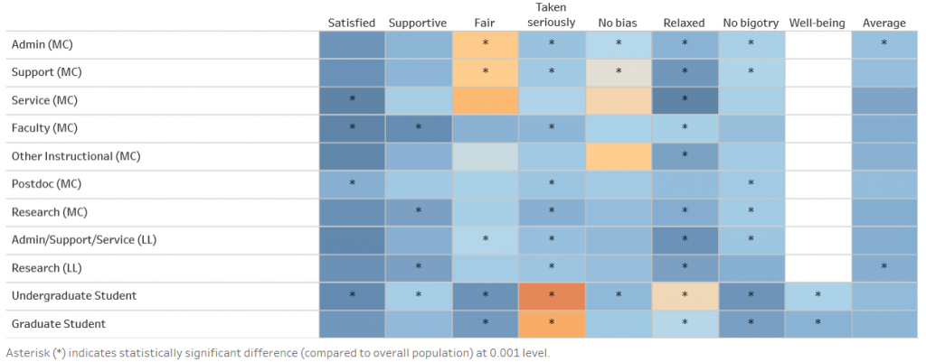
This image shows the default appearance of the dashboard. The left column lists roles (MC for Main Campus, LL for Lincoln Laboratory) with employees at the top and students at the bottom. The top row gives a shorthand name for each survey item (or “scale”) that is used. The colored coding gives mean values for each role and scale (together defining a rectangular “cell”). Asterisks show cells for which the mean value differs from the mean for all respondents to that scale at a significance level p < 0.001. That is, there is less than a 0.1% chance that a difference this large or larger arises from random sampling from the full population.
The most important thing to notice is the color: cells that are dark blue represent “very good” results (highly satisfied, etc.) while cells that are orange are “bad.” Note that a group can have either “good” or “bad” results without an asterisk because cells with smaller numbers of responses have larger statistical uncertainties. In the actual dashboard, holding one’s mouse over a cell shows the average response for the cell, the number of respondents, the t-value, and the effect size (the difference between a cell’s mean value and the average for all respondents, called “Mean Diff.”). The t-value is just the effect size normalized by the standard deviation, and it is used to determine statistical significance. The scales are chosen so that a value of 1 is “good” and for most survey items the maximum possible value is 2 and the minimum possible value is -2. “Bad” is 0 (typically, “neither agree nor disagree” with the survey item).
To avoid getting lost in details, simply follow the colors first, and the asterisks (or mouseover data) if you want more detail. More details on the scales is available in the Notes tab visible in the online dashboard.
A cursory examination of the “heat map” reveals some immediate observations:
- All groups are satisfied; service staff are the most satisfied and postdocs are the least satisfied.
- Most groups feel their department is collegial and supportive, although those with the least social capital (service workers, postdocs, undergraduates) agree less strongly (a value 1 is “somewhat agree”, 2 is “strongly agree”).
- Non-research staff members often feel their department’s procedures are not fair and equitable to all, although students feel that faculty treat them fairly. Fairness and absence of workplace bias are correlated, with some differences notable for other instructional staff (mostly lecturers and instructors).
- Most employees feel they are taken seriously by coworkers (that is, they disagree that “I have to work harder than some of my colleagues to be taken seriously”) but this is untrue for students. The student responses are consistent with a high incidence of imposter syndrome—a feeling of inadequacy and fear that others will discover that one is a fraud.
- The “Relaxed” scale measures the extent to which respondents do not feel frequently overwhelmed. Faculty and students, especially undergraduates, are least relaxed by this measure. (Note the asterisks for faculty and graduate students measure strong statistical significance in the “bad” direction relative to the mean.) Service staff are the most relaxed group at MIT (however, they have the lowest survey response rates, about 30%).
- Students have the least experience of bigotry of any group. There is some arbitrariness in the comparison because students and employees had different survey questions—for employees, the question is about abrasive colleagues or supervisors; for students, it’s about small acts of bigotry based on social identity.
- The “Well-being” item was asked only of students (“I feel that the academic environment negatively impacts my mental and emotional well-being.”). Undergraduate students are more negative than graduate students on this scale.
- The Average column gives the average of responses for all the cells in a row, providing a single summary score for each group. A careful examination shows that Lincoln Lab has a slightly better climate overall than the main campus, but the differences are small. Subjectively, differences in effect size greater than 0.2 are meaningful based on individual stories from group members.
Much more interesting patterns emerge when one divides the groups into subsamples based on gender, race/ethnicity, sexual orientation/gender identity, declared a major versus undeclared (for undergraduates, mainly upperclass students versus first year students), or tenure/untenured (for faculty). The dashboard allows selecting any two of these, and will display results only if there are 15 or more responses in a cell.
The ability to select multiple social identities allows exploration of intersectionality—the compounding effects of privilege or marginalization of different social identities. The data are rich in detail. Among the conclusions:
- Different demographic groups experience MIT differently. In general, being male, white, straight, and of higher academic rank is associated with higher satisfaction, less experience of bias and discrimination, and greater mental and emotional well-being. Being female, URM (underrepresented minority), LGBTQ, and a graduate student is associated with the opposite.
- Of all the social identities, LGBTQ status shows the greatest extremes (“Unsure/Other” is coded as TQ), followed by race/ethnicity and gender. By selecting only one breakout, gender, one can see that gender differences are widespread and systematic. Gender effects are especially large for faculty and other instructional staff.
- Female LGBTQ graduate students have the most consistently bad experiences of MIT climate of any group.
More patterns can be found using the full dashboard. Based on the Average column, the 7 groups with the worst experience are all LGBTQ (L/G/B plus Unsure/Other) or did not answer the sexual orientation question (35% overall did not answer). Combining LGBTQ with female or URM compounds the effects. Imposter syndrome (as measured by the “Taken Seriously” scale) is largest for female students, especially female URM students. Concerns about bias are greatest for female employees and are compounded by intersectionality of marginalized identities. Concerns about bigotry are greatest for LGBTQ students and employees.
If you are an MIT community member interested in participating in or providing advice to the qualitative study of the climate for inclusion, please contact edbert@mit.edu.
Appendix: Some technical details
The choice of survey questions (items) to analyze was made iteratively. A preliminary qualitative study in 2013–2014 identified five major themes for concern: unconscious bias and micro-inequities, discrimination or harassment based on social identity, abrasive conduct, sexual harassment, and excessive stress. The sexual harassment topic was excluded because it was investigated separately in the 2014 Community Attitudes on Sexual Assault survey. Quality of Life Survey items were chosen to sample the other topics. In addition, a principal component analysis of a large bank of survey items was carried out to identify which groups of questions had the most explanatory power. When several survey items were strongly correlated, analysis of variance was used to select the single survey item with the most explanatory power. The list was refined further as different subsamples were investigated, combining information about social identifies, role and work unit. A total of 8 survey items was used for students and 7 for employees and postdocs (one question was asked of students that had no counterpart for others).
The survey data are being used only for administrative purposes and not for academic research. Individual records and any potentially identifying information are kept fully confidential within the Office of Institutional Research, who follow the requirements of MIT’s Institutional Review Board, the Committee on the Use of Human Experimental Subjects. Institutional Research sets a minimum sample size of 5 responses for reporting any results; the Climate Dashboard increases this to 15 in order to reduce statistical uncertainties. A social justice methodology is followed to protect and respect the values and interests of the community including those of different groups defined by role and social identity.
Great work! I hope MIT can continue to develop and refine this dashboard and add data to it as a means of tracking our progress and holding our selves accountable in our efforts and commitment to improving our climate for all!
Thank you, Emily — let’s do it! Mixed methods — combining a quantitative dashboard with the narratives of individuals — will become a powerful way to inspire and assess change. WGS makes this possible!